 | | 2015-03-25 18:12
From blog Floral Prints And Common Sense
Color Schemes
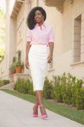
Looks like I gravitated towards a similar color scheme again today! I've been really enjoying playing with colors in my art, stepping away from neutral skin and green grass and pairing things I wouldn't have done before like green and purple, and using more orange than I have before. Orange is an underappreciated color, imo. As usual, what I paint reflects the other aspects of my life, aesthetically and otherwise (or is it the other way around?) In an case, I've been wearing orange on more than just my lips :) Since it's nice out again, and since my knee is starting to feel better, I hope to get outside and do more things soon. I've been watching an...
► See the original article on the blog
| | • Popularity: 0
• Photos: 5
• Language: English
► Her other outfits
► Details on the blog
|

